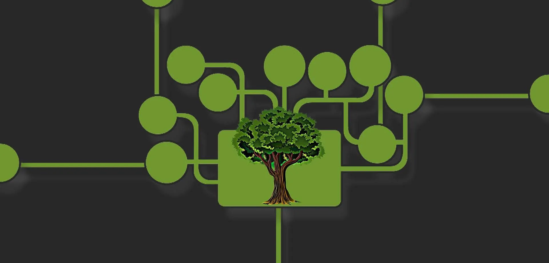
Sustainable web design / sustainable website
The climate crisis has increased focus on the environment and consumption. In our digital everyday life, changes can also be made in various ways.
In this blog post, we explore what sustainable web design and a sustainable website actually are, as well as what you and your web agency can do to ensure a climate-friendly website/environmentally friendly web design.
What is sustainable design/a sustainable website?
We talk about both sustainable web design, which imposes some requirements on the way a page is designed, as well as sustainable websites or sustainable homepages, where there are a few more parameters, such as web hosting, code, content, and other things we will look at in this blog post.
In the same way that you can help the environment in many other industries, there are also good opportunities to help the environment by thinking about sustainability in the design and the website when you need to create a website. Whether it is a small website, an online shop, or a complete system such as a ticketing system or booking, something can be done.
As we will look at in this blog post, you can look at everything from which systems you choose to colors, search optimization, image formats, video formats, and much more. In other words, there is good opportunity to do something yourself and together with your design agency/web agency/SaaS provider.
How do you get a climate-friendly website?
We will look at some of the many things you can do, some of which have a great impact, while others have less. Some are also easily implemented, while others may require larger changes, such as design lines.
Website size
The size of the website can matter, both because a large website can take up more space and thus require more server space, but especially because the load can be greater.
Often it is not the physical size such as the number of pages or the number of products, as this is well optimized in modern systems in a database and does not take up much space, and it only becomes a problem when it is loaded by many users (who see the page). It is more about the way the systems are built (how much is loaded and how heavy it is), as well as your content in the form of images and videos, which we will look at in more detail below.
The reason load times matter is that even if it is not about many KB or MB, they are loaded every time a user visits the page, and it therefore requires a lot of resources for servers and data transmission, which in turn requires electricity.
In the next few sections, we will look at what you can actually do.
Avoid some open-source solutions and too many plugins
Several open-source solutions often load more than necessary, including for example WordPress and Magento. This is especially true when plugins are added where there is often not much emphasis on load times or optimization. This means that these systems are often heavy and thus require more resources from the servers and are therefore less environmentally conscious. At the same time, speed also affects the user experience.
This is well illustrated by a simple Google search on WordPress slow, which yields no less than 77,700,000 results
Read also about other reasons to choose alternatives to, for example, WordPress.
It can therefore be a good idea to go for an optimized SaaS (Software as a Service) system, where speed is optimized and the system is continuously updated and keeps up with the times, ensuring it always loads quickly.
Good search optimization/less load
Some may wonder what good search optimization has to do with less load, but this is partly because Google in the technical part of search optimization has added requirements for fast load times, making page speed an important parameter in search optimization.
This is partly something Google has done to create less load on their servers, but also to help the environment and ensure fewer servers and less data that needs to be moved - and thus less power consumption.
This part is constantly being optimized and improved, and it is therefore important that you choose a system where there is:
- Updates in technical SEO
- Continuous optimization and updates of the system and plugins

Mobile first
Today, the majority of all views are on a smartphone. Therefore, mobile first and responsive web design are also super important parameters.
Partly it ensures that you start by designing for a smartphone to get a good user experience, and when programming, the website is also set up for smartphones first. This means that all the extra load for, for example, tablets and computers is not loaded when you are on a smartphone. This makes it both faster and more user-friendly, but at the same time, it also ensures a more sustainable website. Since the majority of users come from smartphones, you save the load of a lot of data, and thus also electricity.
Color choices
Although it may sound strange to some, colors also matter when it comes to the climate - for example, a blue color uses more energy than red and green colors. It really depends on how much light is needed to render a given color.
There are, however, many other factors, and some screens are much brighter than others, so theoretically a green color on a very bright screen can use less power than a blue color on a less bright screen. A large part of the optimization here is therefore also with the manufacturers of the screens, and they have also become much better over the years.
A disadvantage of optimizing here is that color palettes will be severely limited, and some companies will have to develop entirely new visual identities. It would also mean more uniform pages.
But if you are creating a new climate-friendly website and a new visual identity, you can consider more climate-friendly colors such as green or red, as well as use gray and dark colors more instead of light ones.
Dark mode
Another way to not need climate-friendly colors, but still ensure that the page becomes more climate-friendly, is to provide the option for dark mode.
If the user has the option to set the page in dark mode, just like you know from apps on smartphones, you can keep the original version. It will give users the opportunity to choose a dark mode version if they want it. You should again be aware that recognizability may disappear, as web pages, unlike many apps, also aim to sell, and compete for places on Google - which also makes branding important. Web pages, unlike apps, are not something users have consciously chosen to save, and you may have very few seconds to convince a user to choose your page over another.
So you should consider whether it is something you want - but the option could be there.
Variable or few fonts
Fonts can also help ensure a more climate-friendly website.
This can happen in several ways
- Limit the number of fonts
- Choose 1, 2, or at most 3 fonts for the entire site - also provides better design and usability
- Limit the variation of fonts (bold, bolder, normal, thin, etc.)
- If you do not use variable fonts
- Use variable fonts
- Then you do not have to load each variation of the font - especially smart if you want to use many variations
- Use well-known fonts
- By using fonts that are well-known and widely used, they will often be preloaded by the user from, for example, Google fonts
Again, it is essentially about loading as little data on the page as possible, as this data is displayed to all users who visit your website.
Icons
When using icons on a website, it is also smart to use icon libraries such as Font Awesome.
There are still many websites that use image icons, and they take up much more space than the icon libraries you can use. This means again a larger load and many more calls to the server, even though there are far fewer icons on the page than, for example, Font Awesome offers.
By using Font Awesome from CDN, they can also be loaded in the cache from other pages.
Website structure/minimize views
In the above points, we have looked a lot at content on individual pages, but something that is also super important is the structure.
The goal is to create a structure where you minimize the views and clicks needed to get to a given place.
If, for example, you need to view 4 pages to get to the subpage you need, either because you click through the pages, or because of the mess in the structure, much more will be loaded than necessary.
Therefore, work on a simple structure in the menu (typically only one sublevel), and with the flow you want the user to go through, and make sure there are not a lot of popups and the like.
This helps both the climate and makes it easier and more user-friendly for the user.
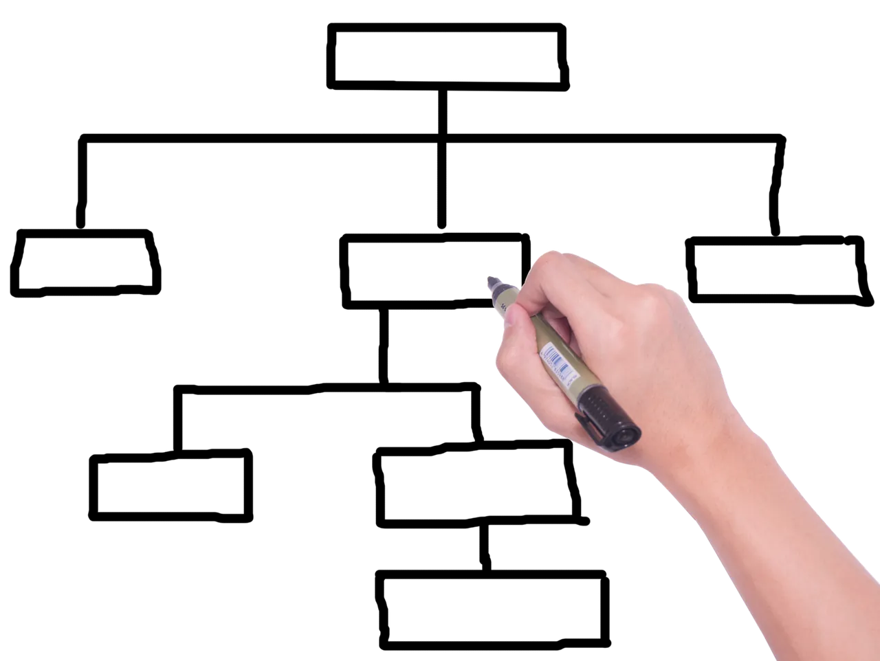
Image format
For a long time, jpg and png have been the leading formats on websites, but now more formats have emerged, including .webp. due to browser support is what is currently recommended.
We describe the webp format in more detail below, and then we will compare the newer formats (gif, png, jpg are not included as they are "outdated formats" in this context)
WebP
Webp has the great advantage of being much smaller without compromising quality. At the same time, it is a flexible format that has the advantages traditionally held by both jpg and png.
The problem with .webp has previously been that it was not supported by, for example, Safari if you had MacOS 11 Big Sur or less. You could make a fallback to a jpg image, but then you need two versions of the same image on the server. MacOS 11 Big Sur is, however, becoming an older version, and you can now use .webp images in most places.
Online tool to convert to .webp (not tested - at your own risk)
Comparison of image formats
As can be seen in the comparison below, technology is moving fast, and webp is on the verge of being overtaken by even better formats, but the reason webp is recommended can be read below.
If we start with HEIC and BPG, they are not interesting for the web as they require a license.
AVIF and JPEG XL are both super interesting formats that will become standard at some point, but the problem right now is that they are not well supported in browsers, and customers will therefore not be able to see them. Using them and making fallbacks does not make much sense as it requires more space on servers to have multiple formats.
Our guess is that after webp, you will likely see AVIF as the most used format on the web
| Property | Webp | AVIF | JPEG XL | HEIC | BPG |
|---|---|---|---|---|---|
| Compression level | High compression efficiency, better than JPG and PNG | Very high compression efficiency, better than webp | High compression efficiency, comparable to webp | Very high compression efficiency, better than webp | Very high compression efficiency, better than webp |
| Quality | Good image quality with both lossy and lossless compression | Very high image quality, supports HDR | High image quality, supports HDR | Very high image quality, supports HDR | Very high image quality, supports deep colors |
| Support in browsers | Widely supported by modern browsers | Limited but growing support (Chrome, Firefox) | Limited support, expected to grow | Limited support, primarily in the Apple ecosystem | Very limited support |
| License | Open and free license | Open and free license | Open and free license | Patented, requires a license | Patented, requires a license |
| Supports transparent background | Yes | Yes | Yes | Yes | Yes |
| Good features | Supports both lossy and lossless compression | Supports HDR, both lossy and lossless compression | Supports HDR, backward compatible with JPEG | Supports HDR, 16-bit colors, animations | Supports deep colors, alpha channels, animations |
| Limitations | Less efficient than newer formats like AVIF and JPEG XL | High decoding complexity, limited support | Limited support, complex to implement | Limited web support, license requirements | Limited adoption, license requirements |
Image compression
Another important thing, which Google also values in search optimization, is whether your images are compressed. Systems always compress images, but rarely as much as you can do yourself.
If you want a fast and climate-friendly page, it can be an advantage to compress your images before uploading them.
There are 2 parameters in image compression, and what you can do depends on the format
- Size
- Quality
Size is important for bitmap/raster images (jpg, png, .webp, etc.) as it affects the physical size of the image file. Therefore, adjust it to where it will be used.
For vector formats such as svg, it is mathematically calculated graphics, and the size can therefore adapt.
Quality indicates how detailed the image is - the lower the quality, the fewer details and the more grainy. Again, it depends a lot on the format what can be set.
Image details
Another thing you can advantageously do is to do some image processing before uploading the image. This is especially true if you have a very detailed image.
The more details an image has, the more space it takes up. Therefore, it can often pay off to blur the image in places where it does not matter. It can both give some nice effects, and at the same time, you also get more climate-friendly images.
Video format
Just like with images, it is also important to choose an efficient video format. There can be a big difference between the various formats.
Webm
One of the most used formats is MP4, which is a good and efficient format, but like png/jpg for images, it is becoming outdated. More efficient formats have also emerged for the web, and especially the webm format is well supported by the various newer browsers
Comparison of video formats
There are also other formats, and we have made a comparison of the various formats below
As you can see, some formats are licensed (H.265 HEVC and H.264) and therefore less interesting
VP9 is like webm well supported but does not have better compression efficiency, and webm is better supported on the web
AV1 looks like AVIF to become the next format for video on the web, but like AVIF it has the problem of support in browsers, making webm preferable right now. There is also high decoder complexity
| Property | WebM | AV1 | H.265 (HEVC) | H.264 | VP9 |
|---|---|---|---|---|---|
| Compression level | Good compression efficiency | Very high compression efficiency, better than H.265 | Very high compression efficiency, better than H.264 | Good compression efficiency, older standard | Good compression efficiency, better than H.264 |
| Quality | Good image quality | Very high image quality, supports HDR | Very high image quality, supports HDR | Good image quality, widespread standard | Very high image quality |
| Support in browsers | Widely supported by modern browsers | Limited but growing support (Chrome, Firefox) | Limited support in browsers, widely supported on hardware | Universal support in browsers and devices | Widely supported by modern browsers |
| License | Open and free license | Open and free license | Patented, requires a license | Patented, requires a license | Open and free license |
| Good features | Supports both lossy and lossless compression, open standard | Supports HDR, very efficient compression | Supports HDR, very efficient compression | Wide support, easy to decode | Good compression and quality, open standard |
| Limitations | Less efficient than newer formats like AV1 and H.265 | High decoding complexity, limited support | License requirements, limited browser support | Less efficient compression than newer standards | Less widespread than H.264 |
Video compression
A major culprit on the internet - perhaps even the biggest climate culprit - is videos. Videos take up a lot of space, and often far too large videos are uploaded - especially background videos on the pages.
It is super important that videos are compressed and adjusted before they are put online, and that they are kept short (especially background videos where users do not watch much).
Videos can be compressed in many different ways
- Professional programs like Premiere made by Adobe
- Free programs such as HandBrake
- Online services compress-video-online, convertio.co, and freeconvert.com
- Own responsibility - we use programs and have not tested these
Especially for background videos, you can compress them heavily, as usually the details are not the focus here.
If you use videos explaining something on the page, you can advantageously use, for example, YouTube. They will compress the video, and you can also promote a channel with videos there.
Many organisations approach video by producing large, high-quality productions. These typically require equipment, time, and post-production editing. The result is often long video files that are heavy to load on websites and can have an unnecessary environmental impact because the files must be downloaded by every visitor.
An alternative is to use short, lightweight video clips. In some cases, AI tools can reduce the resources required to create these clips, particularly when template-based workflows are available, such as in FlexClip. For simple videos built from templates, AI can often require fewer resources than recording footage on a phone and then editing it manually.
AI-generated clips also tend to be shorter. This matters because a video on a website may be viewed thousands of times, and shorter, lighter files reduce both loading time and overall resource consumption.
Marketing and ad optimization
One thing that does not directly concern your website is your marketing and advertising.
We are aware that it is super important for you, but there are ways to be climate-conscious here too, which is even a win/win scenario, as it can also ensure more efficient marketing.
The things you should be aware of (hopefully most already do) are:
- It is not about many visitors - it is about the right visitors
- Conversions are more important than hits
- Remove search terms in ads that do not sell - better fewer and higher conversion
- Remove ads that do not convert properly and try something else
- Create blog posts that match your customers' needs
In other words, it is about spending less money on views that do not generate sales. This also benefits the environment as it is a waste of server power and electricity.
Help the environment
Sustainable web design - or environmentally friendly web design, as it is also called - is an important trend in the technology industry, which, as you can read above, focuses on reducing the negative impact of the internet on the environment. This is done by implementing green technologies and practices in the web design process, such as optimizing content so that it takes up as little space as possible, using energy-efficient servers, designing environmentally friendly, choosing the correct formats, and making sensible campaigns.
Sustainable websites and environmentally friendly web design not only help protect the environment, but they can also improve your website's search optimization. Search engines often reward environmentally friendly websites that have a positive impact on society by giving them a higher ranking in search results. This is due to several factors, but especially the part that reduces resource size (video, images, etc.) has a large positive impact on SEO.
So if you want to make a positive difference for the environment and at the same time increase your website's visibility online, consider implementing environmentally friendly/sustainable web design in your next project.
The Flex4B system is sustainable
With the Flex4B system, you get a climate-friendly system that is continuously updated and keeps up with the times - this applies to both climate, speed, SEO, usability, and functionality.
Some of the things that make the Flex4B system sustainable are
- Constantly optimized system
- Unlike, for example, open-source and third-party plugins, we ensure to create efficient code so that servers do not load more than necessary
- Image and video formats
- We support the new formats supported by browsers so our customers can optimize both sustainability, SEO, and speed
- Updated SEO
- You get free continuously optimized technical SEO, which is also effective in terms of sustainability
- MobileFirst
- Our designs are made MobileFirst, which means that smartphones load as little as possible. Since most traffic comes from there, it helps the environment and makes the experience faster and better for the user
- Font Awesome icons
- We use the Font Awesome icon library so customers can use icons from there instead of using, for example, images that are both heavier and require far more server calls. This makes the site more sustainable and faster for both the user and SEO
- Image compression
- We automatically compress images when you upload them so that they take up less space
- We guide and help you
- Color choices that are more sustainable
- Choice of sustainable fonts
- Menu structure that requires fewer clicks/page views and thus less server load
- Other help to make your system more sustainable
- We host on green servers
Climate-friendly ticketing system
If you are looking for a climate-friendly ticketing system, Flex4Business ApS can also help with that.
We have written a blog post about climate-friendly ticketing systems, and here you can see how we ensure that our SaaS ticketing system is more climate-friendly than many other solutions you can choose.
Do you need a sustainable site?
Flex4Business ApS has extensive experience in sustainable web design and sustainable websites, and we can help you with this both in the design process, with the technical aspects, and with the content on the website.
We also do several things on our own site to ensure it is sustainable.
Flex4Business ApS - sustainable website
At Flex4Business, we have chosen to optimize the sustainability of the website, and we will continue to do so.
We have made an active choice not to optimize everywhere, and we will go through what we do and do not do below. However, we can certainly help if you want to go all-in.
Flex4b.com
- Flex4b.com uses the Flex4B system, which is an optimized system that does not load a lot that is not used
- Flex4B.com does not use hero videos or videos for visual appeal but only uses videos where there is a real need for videos
- Search optimization: It is a high priority, and we have good load time and thus data load
- Mobile First: All websites made with the Flex4B system are Mobile First, including our own
- Color choices and dark mode: We have chosen not to have dark mode as few still use it on websites, and as we become less recognizable. However, we use green, which is not one of the worst, and in the administration also dark contrast colors (dark gray)
- Fonts: We only use one font on the page, and only in a few variations.
- Icons: We use Font Awesome for icons
- Structure: We have a simple structure with one click to most and the most important things
- Image optimization: Our images are optimized to take up as little space as possible to ensure low load time
- Image format: We use the .webp format and have replaced old images with this format throughout the site
- Video optimization: Our videos are optimized for the web and thus significantly reduced in size
- Marketing and ads: We tailor ads as specifically as possible to avoid users who are not interested but still click and load the page
Flex4Business ApS also helps the environment in many other ways - not least through our incredibly flexible work model where people can work from home most of the time.
Do you need a sustainable design/sustainable website, online shop, or ticketing system?
Do you want to hear more about the possibility of getting a sustainable design/a sustainable website?
Do you need a climate-friendly website?
We can help you all the way, whether you just want improvements or want to go all-in.
The Flex4B system is optimized and ready for you to create a sustainable website