Responsive web design
Responsive web design is now a matter of course when you need a new website, webshop or other systems.
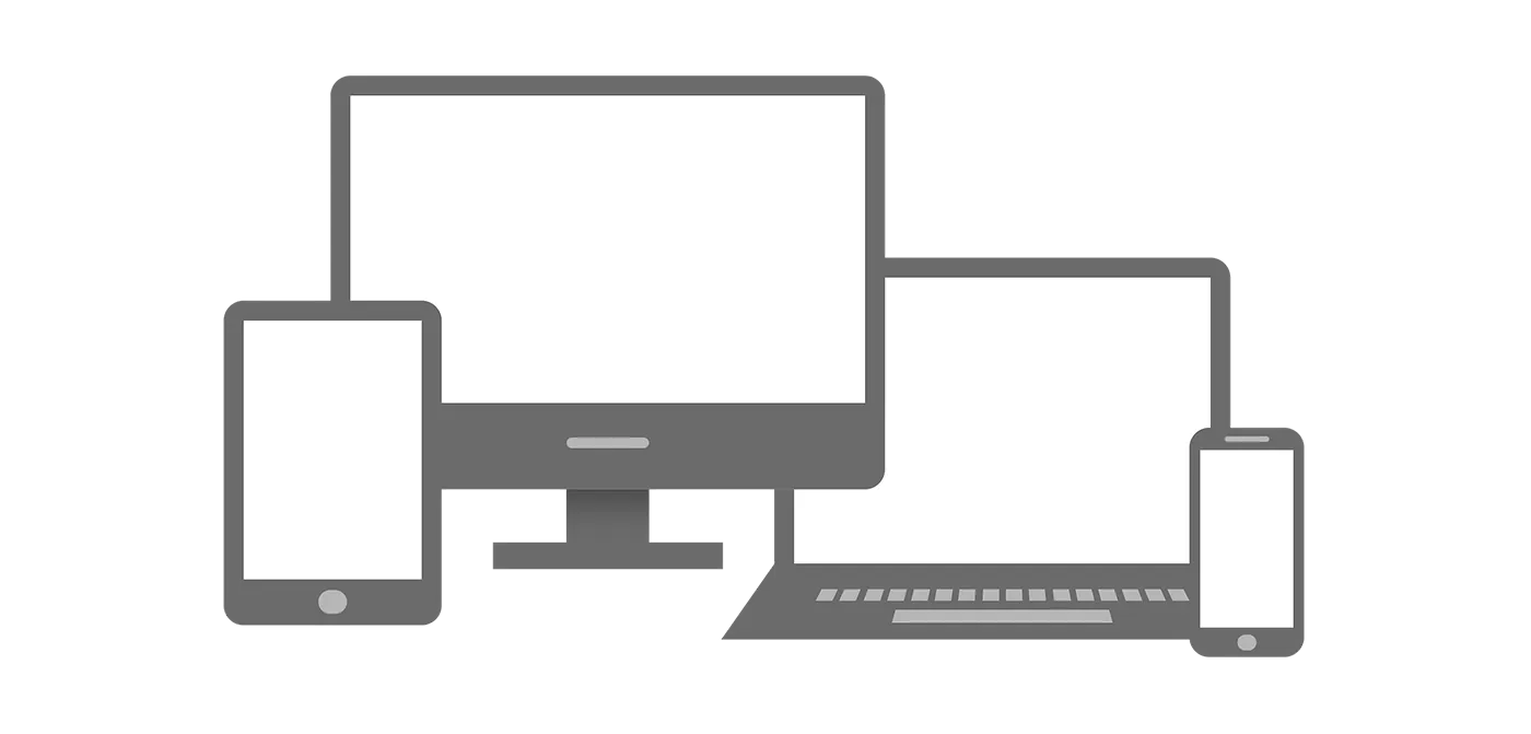
The fact that a website is responsive means that it automatically adapts to tablet, mobile, computer etc. På that way a web page can work on all devices and the design can adapt to the individual device. Read more about what a responsive website is
What is responsive web design?
Responsive design basically consists of; that the design is adapted to the different units and that it happens fluidly.
Today there are many different sizes of screens with different resolutions. This means that the units do not have the same amount of space on the screen.
It is easy to magnify; when comparing e.g. a smartphone with a computer - but there are also difference between the individual smartphones, and på the different computers.
There are 2 parameters that determine how to view the content
- The physical size of the screen
- Available screen resolution
When making the web design responsively; adapted it to all units liquid så one gets a good user experience regardless of which device you are sitting on.
Mobile first
Another important term when talking about responsive web design is Mobile first.
When making a responsive design, should one design for smartphones first and foremost; moving up, and when the page needs to be set up (programmed) or when choosing a system, such as; it is especially important that there is thought in it.
This is because the vast majority of visitors today come from a smartphone. It depends a little on the industry how many there are, but it is in almost all cases well over half - in some industries up to 95%. Then call; If you think about ease of use, you hit the mark the most by focusing on; smartphones first.
In terms of code, it also means; that you only load what is to be used for the mobile phone, and only if it is bigger, bigger, or worse; the things that need to be used there are loaded.
This means, among other things, that you create a more sustainable website, but also that your users have a better experience
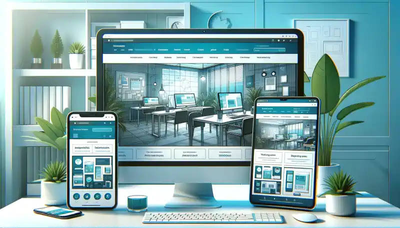
Responsive website with mobile first
The Flex4B system offers a system where your website is always responsive and where mobile first is thought of. It is offered without you having to goå on compromise with design, as we have lots of templates and design elements that mean you can make it exactly as you want. We also help; happy to create the perfect website.
The Flex4B system is a SaaS (Software as a Service) system, which is continuously updated both on technical search optimization, speed, ease of use, new functions and much more.
It can be expanded with plugins, and we also have for example full webshop, ticket system, scanning system, card system and much more.
Contact Flex4Business ApS without obligation and hear more about the Flex4B system, or book a free møde