Background Image in Responsive Web Design
In today's digital world, it is crucial to create an optimal user experience across different devices and screen sizes. Therefore, there are some things to consider as a designer and photographer when working with images for responsive web design.
What is responsive design?
Responsive web design is an approach to website development that enables optimal viewing and functionality across different devices and screen sizes. It involves building a flexible layout structure that dynamically adapts to the screen's dimensions, creating a user-friendly experience whether the user visits the website on a smartphone, tablet, or desktop computer.
Background images in responsive design
Background images are an important part of web design as they can contribute to creating ambiance, visualizing messages, and enhancing aesthetics on a website. In responsive web design, it is important to ensure that the background image adapts to the device's screen size without losing its meaning or aesthetics in the process.
Cropping images for responsive design
One method of adapting background images in responsive design is cropping. When cropping an image, ensure that its essential content remains visible regardless of the screen size.
It is usually recommended to place the main content, such as the focal point, in the center of the image. This way, you can crop equally from both the top and bottom or from the sides of the image when the screen size changes, without losing its central significance.
The illustration below depicts the challenges when planning the image.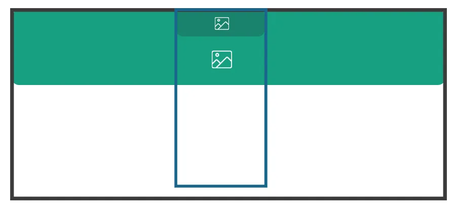
The black frame represents the computer, while the blue frame represents the mobile device. There are two options for adapting the image for mobile viewing. The first option is to crop a large portion of the image, as illustrated by the light green box. This preserves the image's height and ensures it looks good on mobile. Alternatively, you can scale down the size of the image, as shown in the dark green box. This will make the image much smaller as the height is also adjusted, especially if the image is taken in landscape format.
Usually, cropping the image is preferred as it is more user-friendly. However, as a photographer or designer, you need to consider placing important elements in the center of the image.
A good idea when taking pictures for background images is to use the 4:3 format (which many phones also use) instead of widescreen. This way, there will be less cropping on mobile, but some cropping may occur at the top and bottom on the computer.
Zoom and spacing
Just like when creating background videos, it is important to ensure that images are not zoomed in too much, and that important content is positioned in the center when planning background images.
In the illustration below, make sure your important content is within the yellow frame and understand that depending on whether you are on a smartphone or a computer, cropping will occur either on the sides or at the top. The image should work when only the yellow portion is visible, allowing cropping both above, below, and on the sides.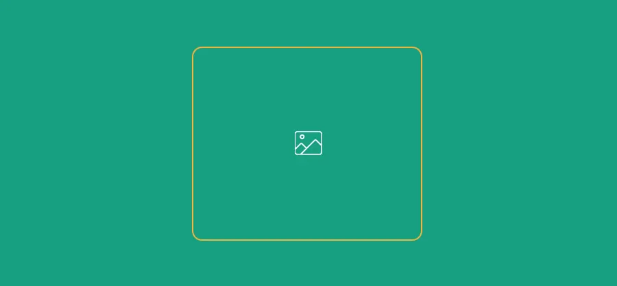
This also means that you should focus on using images where zooming is not excessive.
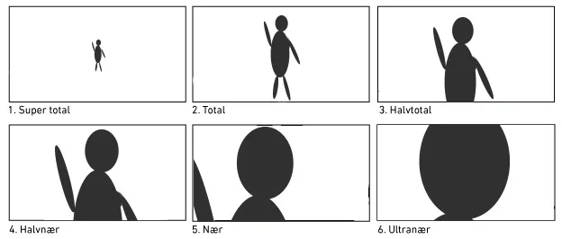
In the illustration below, "1: Super total" and "2: Total" will clearly work best, while "3: Half total" may also work in some cases.
Images taken in "4: Semi-close" "5: Close" and "6: Ultra close" distances will often be unsuitable as background images in responsive web design as they may end up being cropped incorrectly.
Text on images
It is generally a poor practice to include text directly in the background image. There are several reasons for this:
- Text included in the image is not search engine optimized.
- Text in the image may appear blurry or pixelated.
- Text in the image may be poorly cropped on different screen sizes.
Therefore, text should always be added on top of the image afterward, and it should be accepted that it is not suitable for background images and similar purposes.
Background images in the Flex4B system
In the Flex4B system, there are many ways to use background images, and there are plenty of templates with different methods of using background images, including slideshows and much more.
Find free images
If you need images and don't have the opportunity to take them yourself, there are several places where you can find free images. Here are a few of the most popular ones:
You can also generate images using AI. Here are a few examples:
Background images in responsive web designGuide for background images